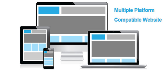
Responsive Mobile, Tablet and PC Ready Sites
With an enormous amount of consumers turning towards the mobile devices such as smartphones and tablets, the demand of mobile website is increasing fast. Mobile websites are great way to bring your business to mobile users who will only be interested in reading your website if it is optimized to display correctly in their mobile device. This will ensure your online business will be accessible with all internet users, not just the ones that open on their desktop/ laptop computers, so it is best to build a mobile site using a single platform that builds your site into a responsive format, A responsive website ensures compatibility on multiple platforms; tablet, smartphone, desktop, laptop, mac etc.
Website Builder to Build Cross Platform Compatible Website.
Go Daddy has been working hard to bring powerful website tools for users that are state of the art and compete with any other service on the internet. In order to deliver a mobile ready website, go daddy has incorporated a automatic mobile conversion system within their website builder software. The powerful menu builder by Locu works flawlessly in all browsers and platforms as well as different screen sizes. This multi-platform compatible tool automatically creates version for smartphones and tablets.
Free Mobile Site by GoDaddy Website Builder Tool
As a new website owner, all you have to do is to register a new domain name, next choose a suitable hosting plan that suits your online business. Now comes the fun part, you can simply go to website builder and select a theme/ template that matches your business niche. For example if you need to sell products online, you can choose e-commerce theme, or for business that provide services, you can select the business website template. Next you can use the powerful Locu tool to create SEO rich menu for personalized services offered online. This website builder is intelligent enough to deliver a website that displays the website according to the platform in which website is loaded. Whether you open your website in PC or MAC, large screen size or small screen resolutions of different computer browsers. Your website will display mobile converted version when loaded in smartphone or tablet. The page will automatically fit according to your mobile device screen size, hence you get a free mobile site for smartphone browsers.
“A responsive website layout generates mobile site version, making your website mobile-ready, desktop-ready as well as tablet-ready”.